polices sans serif

The History of Sans Serif Fonts: From Simplicity to Modern Design

Sans serif fonts are everywhere—from sleek websites to minimalist logos. But where did these clean, modern typefaces come from? The history of these fonts is a fascinating journey through design trends, printing innovation, and the digital age.

What Are Sans Serif Fonts?

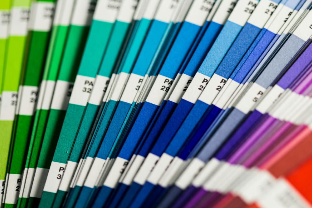
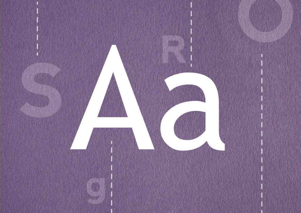
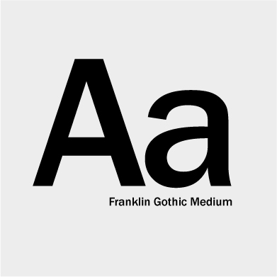
Before diving into the history, let’s define them. The term comes from the French word “sans,” meaning “without.” Unlike serif fonts, sans serif fonts don’t have small lines or “feet” at the ends of letters. This makes them look simple, clean, and easy to read—especially on digital screens.

Early Beginnings: 18th to 19th Century

The first known example of this typeface appeared in the late 18th century. At the time, they were used mainly for decorative or attention-grabbing purposes. In 1816, the William Caslon foundry in England released the first sans serif font known as “Two Lines English Egyptian.” It wasn’t an immediate hit, but it planted the seed for future designs.

sans serif

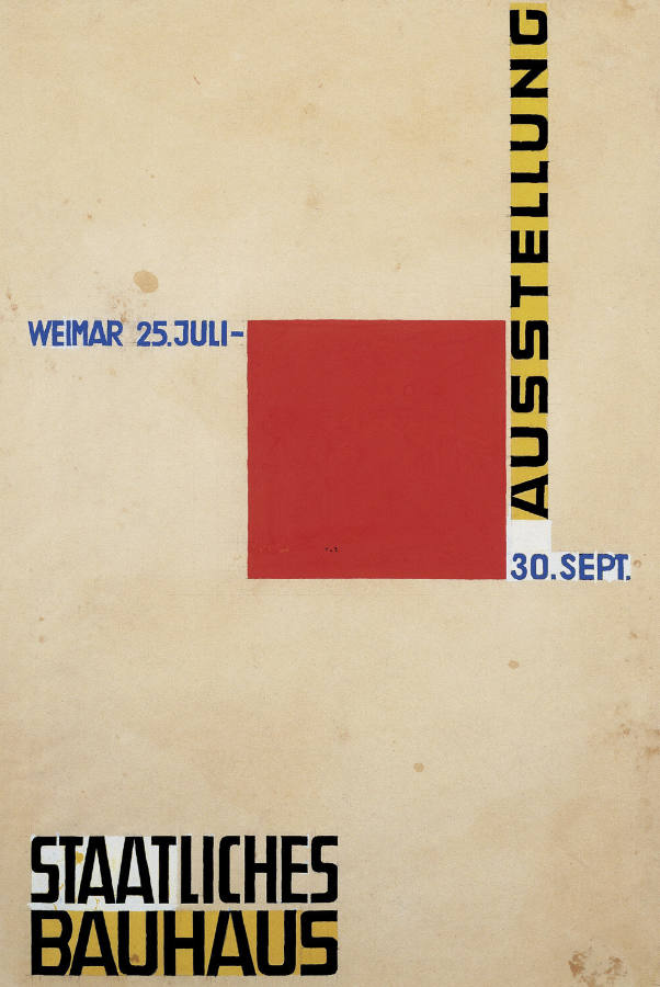
Rise in Popularity: Early 20th Century

By the early 1900s, sans serif fonts gained popularity, especially in Germany. The Bauhaus movement played a key role in this shift. Designers like Herbert Bayer championed functional, geometric forms—and these typefaces fit perfectly.

Futura, designed by Paul Renner in 1927, became one of the most iconic geometric fonts. Around the same time, Gill Sans by Eric Gill introduced a more humanist take on the style.

Mid-20th Century Icons

The mid-20th century brought some of the most widely used sans serif fonts ever. Helvetica, designed in 1957 by Max Miedinger, became a global standard for its versatility and neutrality. Univers, another Swiss design, also gained traction in corporate and public signage.

These fonts were embraced by brands, governments, and designers alike. They symbolized modernism, clarity, and trust.

In the Digital Age

With the rise of computers and smartphones, sans serif fonts have become even more dominant. Their readability on screens makes them ideal for web design and user interfaces.

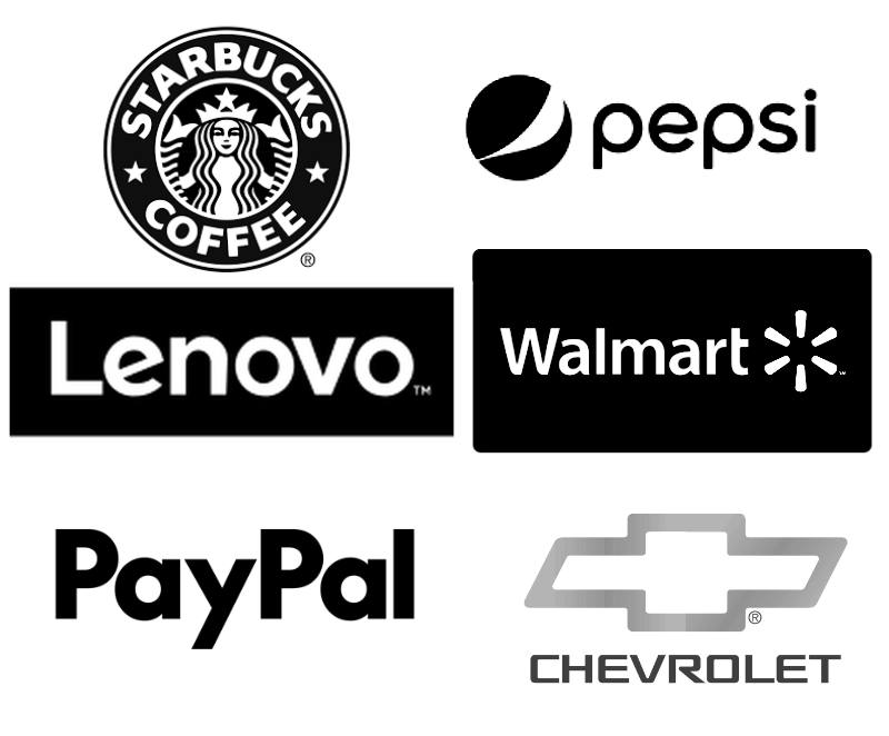
Fonts like Arial, Roboto, and Open Sans were designed specifically for digital clarity. Today, companies use custom typefaces to define their brand identities across platforms.

Why Designers Still Choose Them

Designers love these fonts because they’re:

  • Clean and modern
  • Easy to read on screens
  • Flexible for branding
  • Great for minimalist designs

From high fashion to tech startups, sans serif fonts are the go-to choice when simplicity meets impact.

Would you like us to talk about any special subject? Contact us!

guía pantone - guide pantone

Exploring the World of Color: The Pantone Guide and Its Uses

In the fascinating world of design and printing, the Pantone Guide stands out as an essential tool—a reliable compass for color enthusiasts. But what exactly is a Pantone Guide, and why is it so valuable across various creative fields?

At its core, the Pantone Guide is a systematically organized set of color swatches, each assigned a unique name and number. Known for its precision and consistency, this guide has become a cornerstone for professionals in graphic design, fashion, printing, and more.

What Is the Pantone Guide Used For?

The guide serves as a common language among designers, manufacturers, and creatives across many industries. Each shade is given a unique Pantone name and number, allowing precise communication and eliminating the ambiguity of generic color names like “sky blue” or “emerald green.”

Recommended Uses:

  • Graphic and Web Design: It is crucial for ensuring consistent color across digital and print media. It helps designers match on-screen colors to printed versions as closely as possible.
  • Fashion: In fashion, where color accuracy is vital, designers use the Pantone Guide to communicate specific hues to fabric and garment producers.
  • Printing: In the printing industry, Pantone is indispensable for maintaining color consistency across different materials and techniques. It streamlines communication between designers and printers.
  • Visual Arts: Artists and illustrators also rely on Pantone to choose consistent colors for their artwork, enhancing the visual harmony of their projects.
  • Marketing and Branding: In branding and marketing, Pantone helps define and maintain a company’s visual identity. Using exact Pantone shades ensures all promotional materials reflect consistent brand colors.

In Conclusion:

The Pantone Guide is a versatile and essential tool that transcends creative disciplines. From graphic designers to fashion manufacturers, its influence and reliability make it indispensable for those seeking precision and consistency in the world of color.

Header photo by Christina Rumpf on Unsplash.

Would you like us to talk about another useful subject? Contact us!

¡Sabrosura! Colombian Flavor in Chile

I have a friend I met a long time ago in a chat, a website to learn languages, almost 7 years ago. We have kept in touch since then and this time, he invited me to work on the corporate image of his project “¡Sabrosura!” (tastiness in Spanish), A fast-food stand.

The Client

They currently reside in Chile, but my friend Jay and the chef are both Colombian, from the coast. We know that the Caribbean trying and transmitting. That is why they chose warm colors for their image.

They remind us of the sunset of the Caribbean, the sun, and the sea. In addition, these colors by their nature open your appetite.

The chef’s smile is wide and you can almost hear him shouting SABROSURA! when entering through the door.

Everything was made from a couple of photographs of the actual chef of the place. From there, we start to make the design of the character.

I have to confess that it was a little complicated for me since I was very afraid of falling into stereotypes. Thanks to the universe and an extensive graphics search, everything went well and the client was very happy.

As a note, this was an urgent job, of those “for the day before yesterday”, since they were urged to open the business and start working.

Even more “¡Sabrosura!”

There are still more things to do as the menus and other advertising material. But we wanted to move forward because we wanted to share that smile and the good vibes that this team transmits to us. Much success!

To follow the news on this and other projects, please follow us on our social networks: Facebook and Instagram.

Do you have a similar project that you want to develop? Contact us here!