Flyers: Are They Useful?

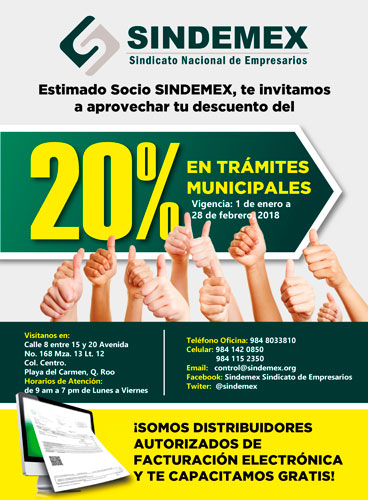
In Mexico, the use of flyers is still common. However, their cost is rising because it’s not just about paying for the design and printing. Usually, you also need to hire flyer distributors to hand them out.

Although, as we mentioned, the reach of flyers is broad, they don’t always reach the right audience.

We often see flyers rolled up on fences, stuck to car windows, etc.

Unfortunately, many of these prints end up in the trash.

Both the client and the end-user are aware of this, yet a lot of effort is still put into the design and content of the flyers.

They are much more effective when they include a promotional code, coupon, or any element that encourages the user to keep the print. Mi Patio.MX and Hippo Restaurante made good use of this idea.

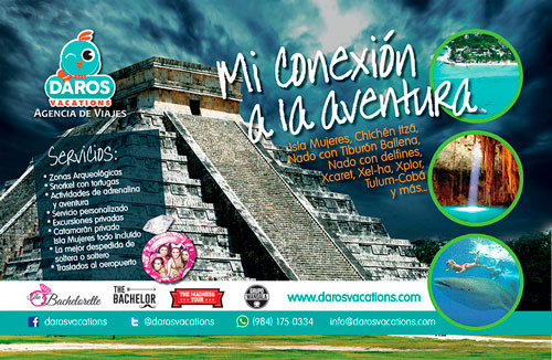
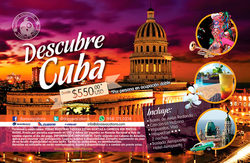
Here are some examples from our clients:

The evolution of flyers:

The advantage now lies in the popularity of social media and the advertising—both organic and paid—that it offers.

By organic, we mean the reach achieved without financial investment, gained through users voluntarily sharing the content.

Today, it’s possible to reach people who are genuinely interested in what we have to say. Through segmentation, it’s much easier to attract clients and/or achieve more effective brand recognition. For instance, Riviera Maya Catamarans often shares its content with its main clients, who are based in the United States.

In general, social media ads contain little text (a maximum of 20%), as this makes them easier to approve on the platform and more appealing to the end-user. Unfortunately, in our country, people read very little and prefer to see the text directly on the image. For this reason, exceptions are often made with longer text.

Below, we showcase a few examples of our work.

¡Sabrosura! Colombian Flavor in Chile

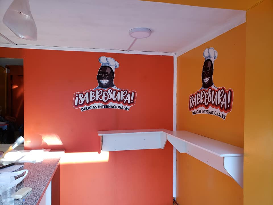
I have a friend I met a long time ago in a chat, a website to learn languages, almost 7 years ago. We have kept in touch since then and this time, he invited me to work on the corporate image of his project “¡Sabrosura!” (tastiness in Spanish), A fast-food stand.

The Client

They currently reside in Chile, but my friend Jay and the chef are both Colombian, from the coast. We know that the Caribbean trying and transmitting. That is why they chose warm colors for their image.

They remind us of the sunset of the Caribbean, the sun, and the sea. In addition, these colors by their nature open your appetite.

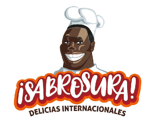
The chef’s smile is wide and you can almost hear him shouting SABROSURA! when entering through the door.

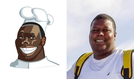
Everything was made from a couple of photographs of the actual chef of the place. From there, we start to make the design of the character.

I have to confess that it was a little complicated for me since I was very afraid of falling into stereotypes. Thanks to the universe and an extensive graphics search, everything went well and the client was very happy.

As a note, this was an urgent job, of those “for the day before yesterday”, since they were urged to open the business and start working.

Even more “¡Sabrosura!”

There are still more things to do as the menus and other advertising material. But we wanted to move forward because we wanted to share that smile and the good vibes that this team transmits to us. Much success!

To follow the news on this and other projects, please follow us on our social networks: Facebook and Instagram.

Do you have a similar project that you want to develop? Contact us here!

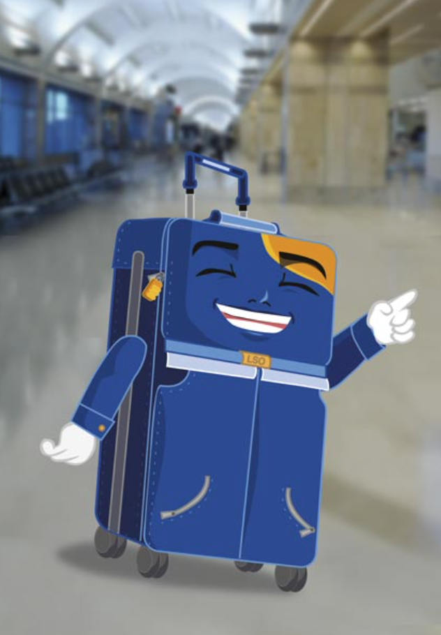
Lukas, from Lost Baggage, Character Design

Lukas, the main character of the Lost Baggage saga is the result of an interesting process since everything was planned and made “long-distance”

In itself, the character design needs an intense work and a strong focus on the details. This is usually complicated if the intellectual and operative parts are distant.

The author was in Italy and we were in Mexico. The time difference made everything more difficult since delivery times become relative. If we present a proposal on day 1, the corrections arrive on day 2 or 3, so the next proposal comes on day 4 or 5 to the next revision.

Even so, we arrive punctually to the deadline, even if it’s a bit haggard.

Lukas, a Gay Suitcase?

It may sound strange, but once you have read the book you can understand this concept. Being cataloged as “Magical Realism”, the story introduces diverse characters with interesting personalities.

The story is divided into two parts: Lost Baggage “La Madrugada” and Lost Baggage “End Times”. Even though we provided the character for the cover of “End Times” the general design of the book is the editor’s work.

Sketching

Two options were prepared from the approach. Once the concept was chosen, we continued to make the respective corrections.

In the same way, there were two more correction sessions until we reached the final product. The whole process took approximately a week and a half because the publication of the book was near.

We delivered 5 facial expressions, three views, and different file formats, including vectors. We also delivered the copyright session letter to Marie O’Malley, author of the saga.

To work with a character is to know him. Make it your friend. You get to know him so well that you can imagine even his voice. Lukas spoke to us throughout the process, smiling at us, getting scared, and telling us who he was.

We miss him!

Sketching: David Hernández

Art & Design Director: Doris Hernández